Amrest

Web/Mobile app- UX/UI
Project Overview
On-line food ordering and delivering is a very popular topic lately. There are many competing platforms on the market like Uber Eats, Pyszne.pl and Wolt for example, however all of them offers very similar options and features. People who wants to order meals together, no matter whether in the office or at home or at a big party, are forced to make limited choices when they want to receive one order to avoid additional delivery fees and eat together. Amrest decided to change this and propose the possibility of combined orders for several people with the option of choosing dishes from various restaurants, which allows to enjoy your favorite meal with friends and colleagues.
My Contributions
I was asked to design the food ordering process for several independent people using different devices with the possibility of combining it into one merged order. The process had to connect the order remotely and regardless of whether the user uses a smartphone or computer. Also the split payment by users was a key feature.
I based it on a customer journey created by UX Designer from another team, so the task did not require determining touch points and the goals that the user would like to accomplish. So I focused on creating the best UX Flow application itself and a way to smart combine shopping baskets of different people who want to make one order.
Amrest
process
I had to design a friendly and easy-to-use system of merging orders by different people, who are not necessarily stay in one location (ex. people ordering shared meals from office but works in different rooms or floors).

I decided on a solution where one person hosts the order and others have join it. A person creating a new order invites their colleagues and provide them a unique order ID code, and share it using popular tools (e-mail, messenger, instagram). People joining the order enter the ID code in the appropriate field (or click on the link received in the invitation).

Additional feature is the use of QR codes - if users are next to each other can quickly and without having to rewrite long codes connect the order by scanning QR code directly from the screen of the second user hosting the order.
Another key problem to solve was the split payment between theusers. Each one has their own basket to which they add positions from selected restaurants. When the are ready and finished the selection process, they selects the "That's all, thank you" button and then choose the convenient model of paying for its order (payment by card or BLIK).

If the user cannot pay for his order by himself (insufficient funds, no card number at hand) he can ask the host to pay for his order by sending such a request.

At the end of the purchasing process, the user who host the order sets one delivery address for everyone. This person also has a preview on the complete order of all users. He can also see mentioned requests for payment for another user. If the host chooses accepts this request he pays for his colleague. He may also choose to refuse and delete it.
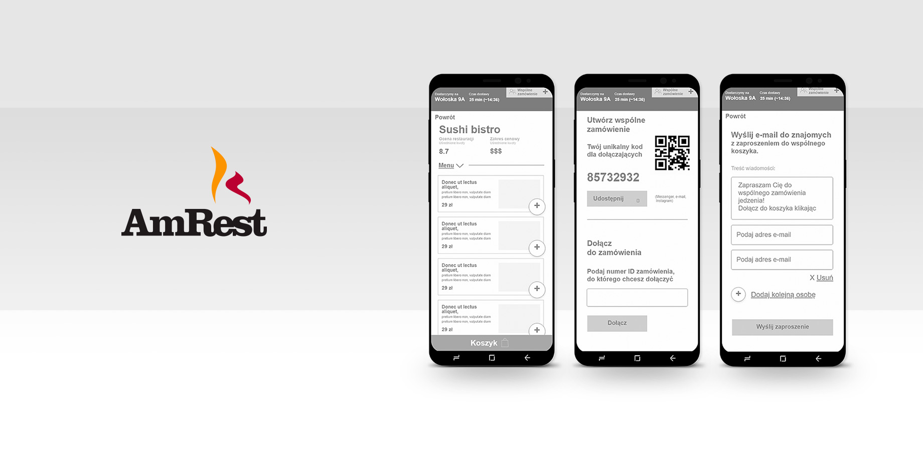
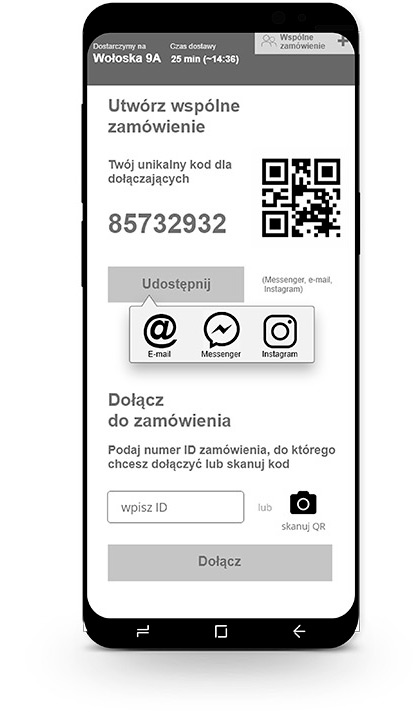
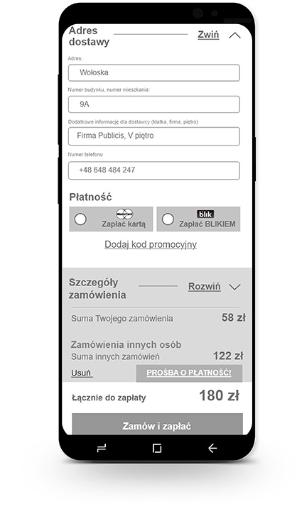
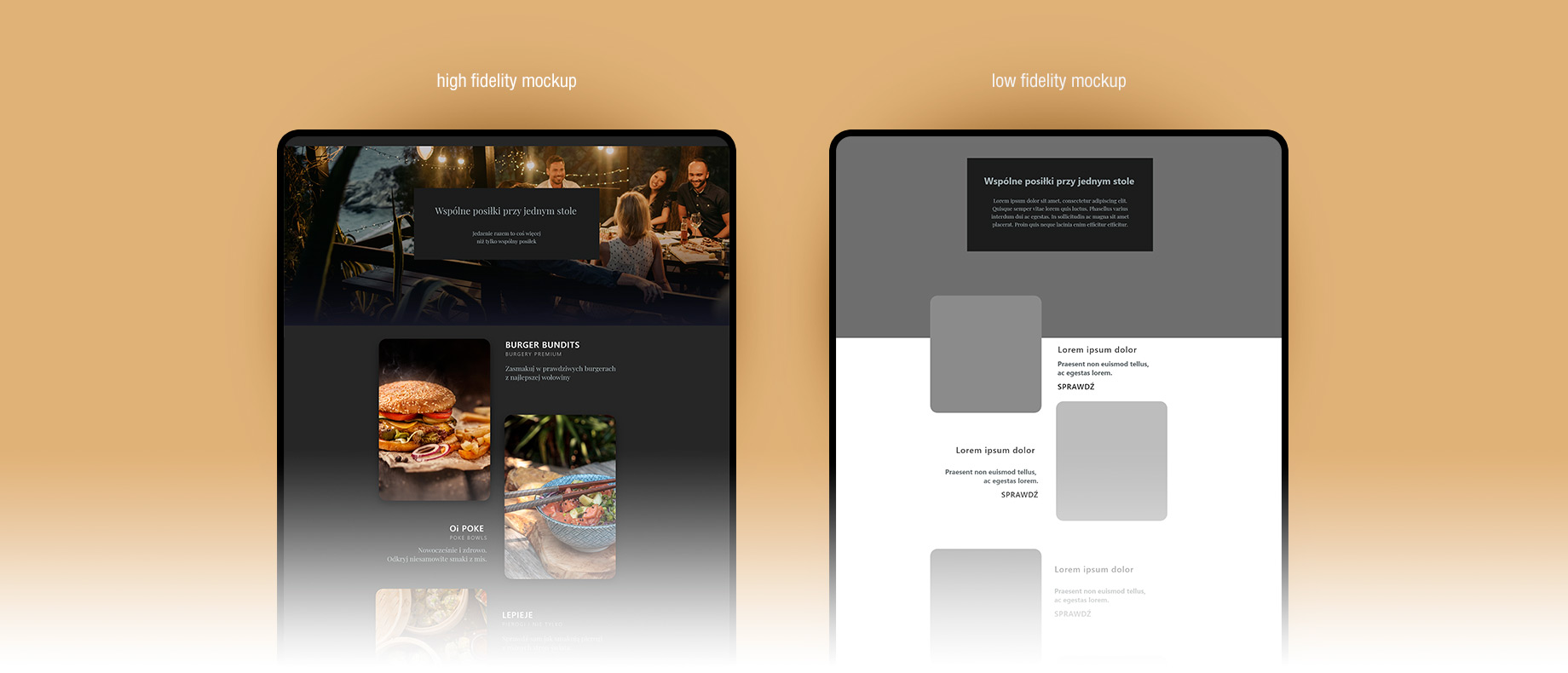
High fidelity mockups were created at the next stage of the project. Unlike low fidelity mockups, which only initially present the distribution of functional elements, first ones already present the possible UI look, general mood, and first selection of colors.


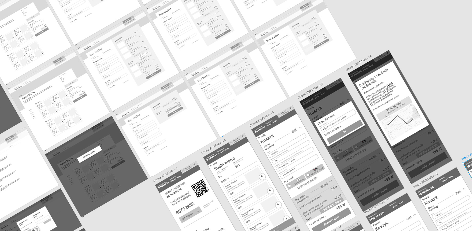
System was designed for both, mobile and desktop experience to meet the needs of people working in offices, using computers and some of them unable to tear themselves away from the desk, and those who are constantly on the move.
Check out interactive mockups