Prudential

Web/Mobile app - UX/UI
Project Overview
Saving, regardless of whether to ensure safety, for our childrens future or for your own retirement is never easy. Many of us postpone this topic because they find it complicated and uncomfortable. We even don't really know how much money we should save to meet our future requirements. Prudential addresses this problem and allows us to save for various purposes in relation to our real needs.
My Contributions
My main task was to guide the user through the process of determining the real needs to accumulate sufficient funds for the future. Many users of the product are completely unfamiliar with finances and moreover, the process is perplexing and they would like to get it done quickly and immediately.
The desktop version of the appl was also to be used by Prudential sales worker, who during the meeting guide the client through all the steps of defining financial goals for the future. It was important, however, for the user to be able to easily carry out the whole process at home from their own computer or even a mobile phone. The application was to be used by various people of very different ages and levels of financial and technological knowledge.

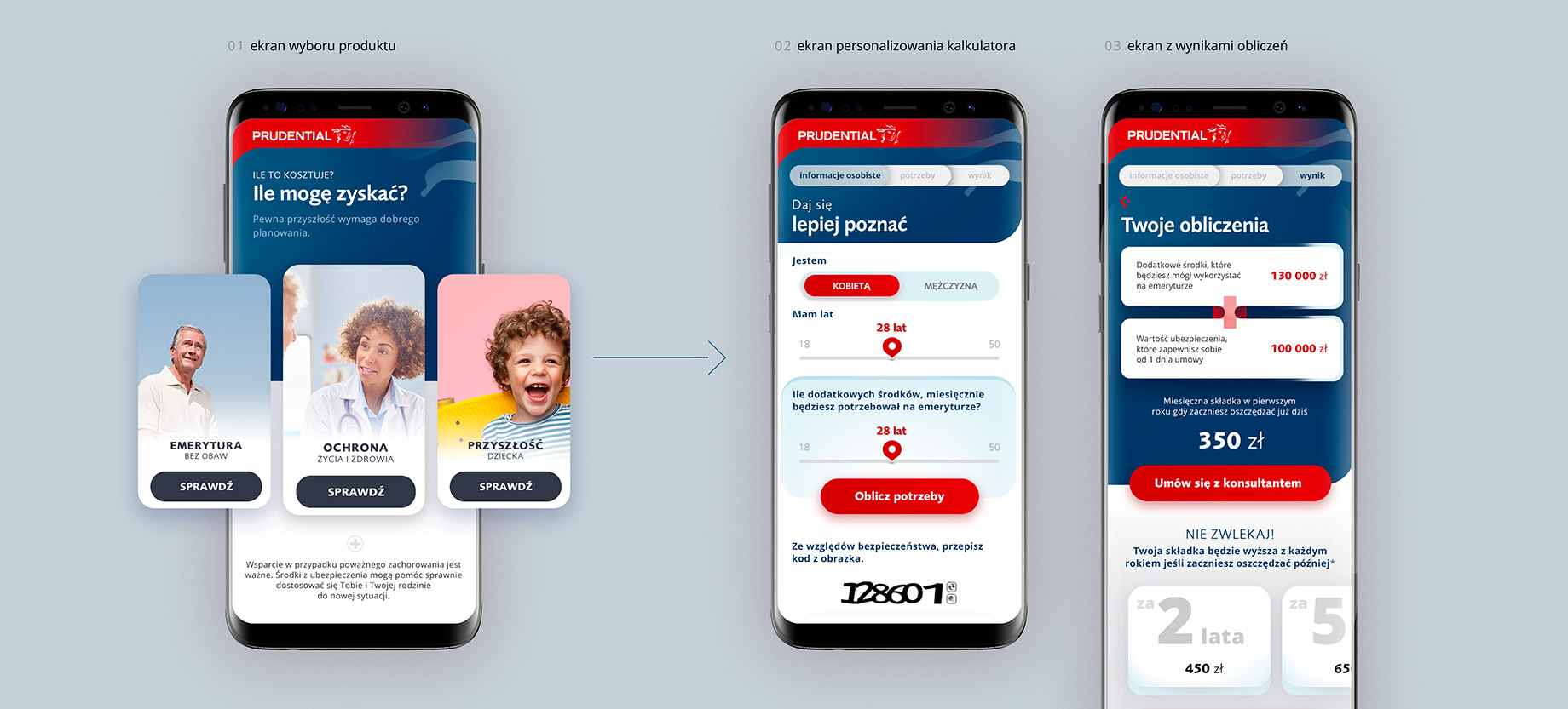
During designing, it was extremely important for me not to overwhelm the excessive amount of informations appearing on the screen and lead the user through the whole process by asking simple questions with the possibility to choose the answer that interests us.

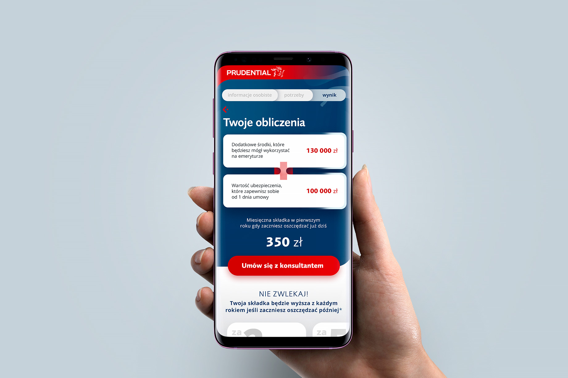
I decided on the form of cards (wherever it was possible) suggesting matching answers where the user, instead of entering information in dozens of forms, clicks the appropriate card with his finger and can go to the next question in full-screen view.
Prudential
process
The calculators have been designed for the most popular breakpoints such as smartphone, tablets and desktop computers. The user must have a comfortable interface and experience regardless of the device he currently use.

Additionally, if he decides to return to the system on other equipment he should have a sense of familiarity and lack of confusion so nothing is changed dramatically,
It was very important from the level of usability to determine the user's current position on the path of the whole process. Many of potential customers feel lost when they navigate through complex financial pages. I made sure that users, at every level, receive proper information about the their progress and hints & tips for the choices they can make.

Key information on the results page of the process has been presented in a clean and contrasting layout to ensure good readability of elements also keeping in mind older people and those with vision disabilities.

An important aspect of the entire project was to cooperation with the client at the UX Writing so that messages for users were clear, understandable and short.