toPRO do

Web app - UX/UI
Project Overview
Efficient management of time, processes, people, projects and files in a modern team is a huge logistic challenge. An application that combines these functions and is also a communication hub is a solution for many companies in today's world.
My Contributions
Together with the developer (we were the only creators and founders of the app), was to determine all the necessary system functionalities. I had to design all the app screens to let perform hundreds of tasks by different people at different levels of access and technical advancement. The application had to be accessible and understandable, but also appealing for long working days.
The first step in setting goals was to research the market for similar products from competitors and check what functionalities they are offering. Actually there were few similar products on the market, such as Basecamp, Guru etc. However, they are expensive and have a lot of restrictions that did not suit us. We though what could be improved and done even better...?

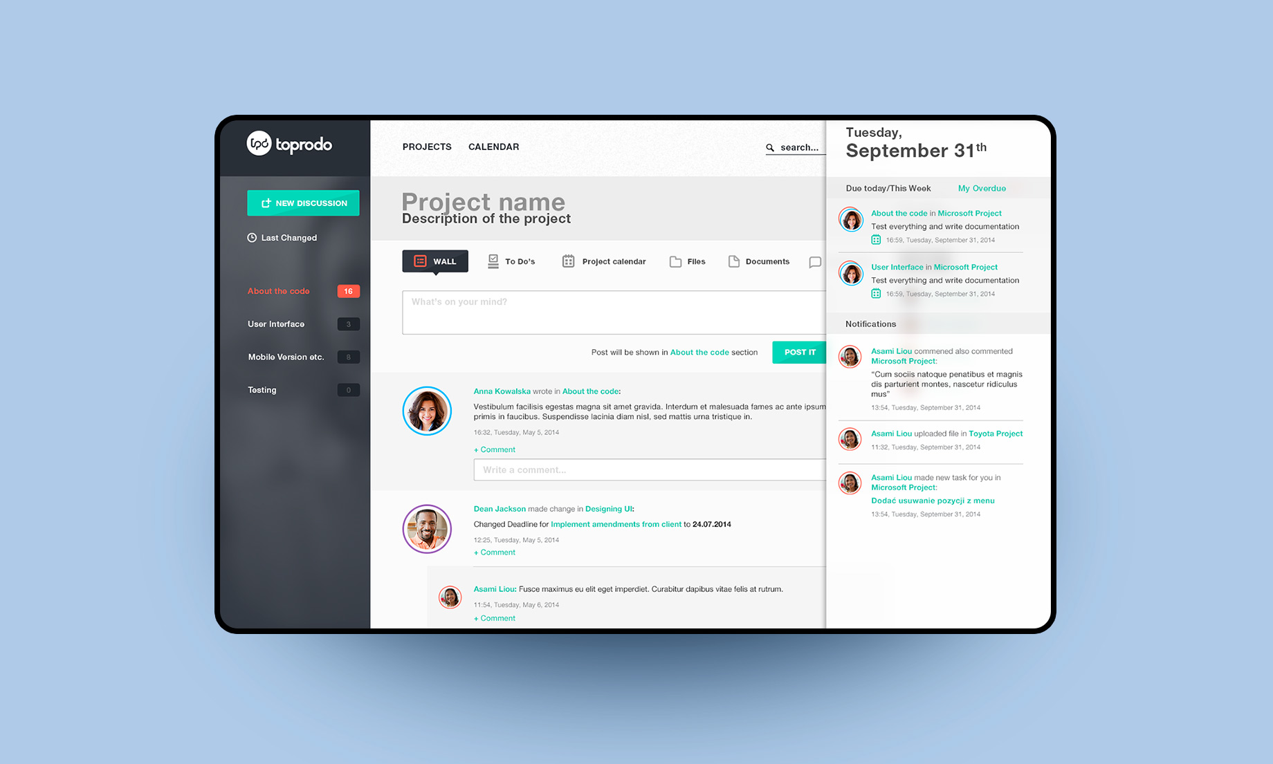
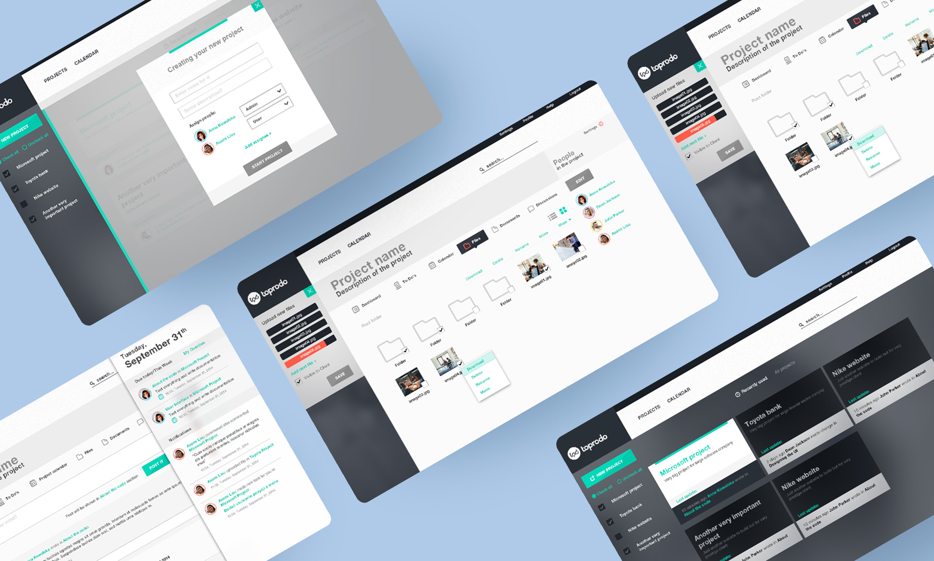
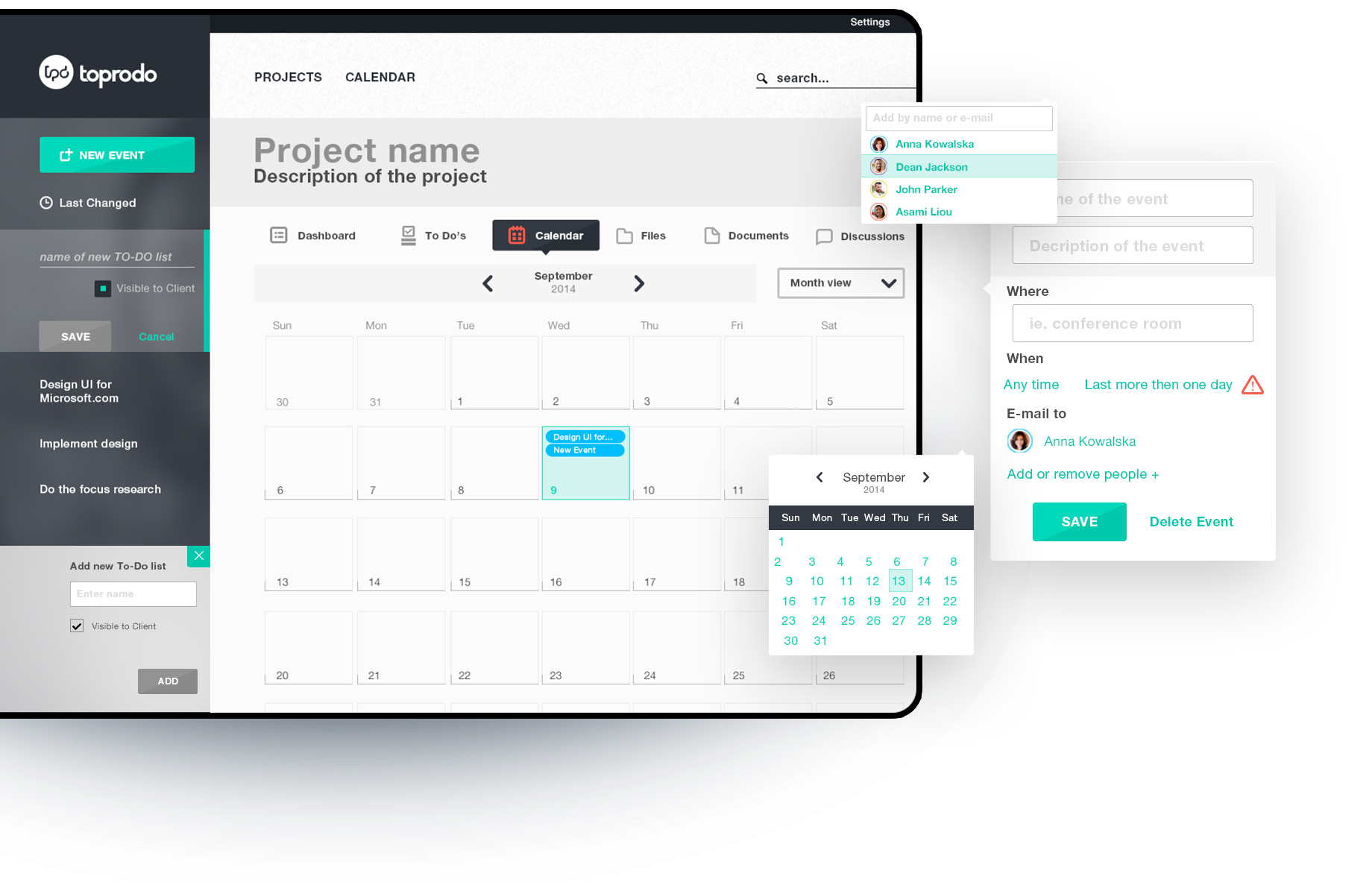
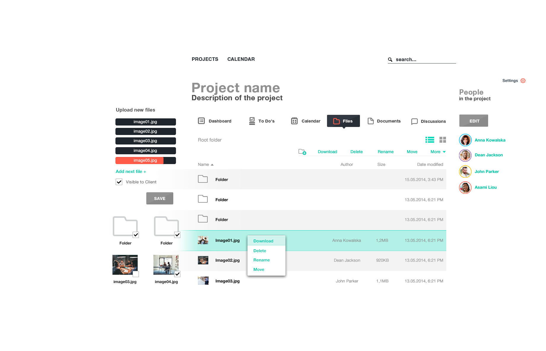
We have started with personas corresponding to various positions in the virtual company and we have defined a list of tasks that they could potentially want to accomplish. The tool had to combine many functions such as To-Do lists, calendar, messenger, file repository, documents and chat functions as well as communication wall where all the involved people could easily see what's happening on the project.

I decided to use colors to sort users according to their function in the team, which will helps in quick identification. I also decided to place key tasks for the view on the fixed the left, contrast panel of the application.
toPRO do
process
Every tool is as weak as its weakest point. If users do not want to use it often it will become unnecessary expense for the company and wont solve any problems. That is just bad UX, right?

Dashboards which you can easily navigate through horizontal menu such as To-Do lists, calendar or files must be transparent and clean in form. I decided to use colors only where they carry important information or are associated with another element of the same color. Small animation of the UI make it more awesome and delightful.
Proper typography and layouts were crucial in UI design so that the information could be sorted clearly and there was no need to create additional graphic elements that would distract user from navigation on dashboards.

Minimum design, maximum message and seamless UX.