Renault - testuj z pasją

Webdesign- UX/UI
Project Overview
The Renault website - testujzpasja.pl was created 2 years ago in cooperation with the Publicis agency. It was designed to aggregate Renault car test and reviews made by celebrities or other interesting personalities. The main goal, however, was to collect leads and arrange users to test-drives and of course to encourage them to buy a new car. The site unfortunately had some issues and did not perform as well as we would like to even we create dedicated and interesting content that appeared on it. I was asked to redesign it and identify new opportunities with the team.
My Contributions
My role was to find a better way to convince user to leave a lead in a contact form. Presenting cars and new features in pleasant way was also a thing but the client wanted to improve the performance
at all costs.

We've been shortly briefed and client let us know that he needs also to implement performance, analytic and A/B testing tools on the website.

I decided to go for high fidelity mockups (but these are still mockups level, not the final design :)) for presentation to show the UX flow but also to unveil the secret of my first design idea for the layout and interactivity.
The simplest solutions are always the best - so it was obvious to emphasize and redesign the contact form where users leave their lead. Plan was to make it visible, simple and not overwhelming.
Renault - testujzpasja.pl
process
I decided that the form must be available and accessible from anywhere on the page regardless of what the user is currently browsing. I designed a distinct Call To Action button on both, the mobile and desktop versions, to sign up for a free test drive.

Its fixed position, pinned to the top bar of the page means that it is always visible on the screen even when the content is scrolled.
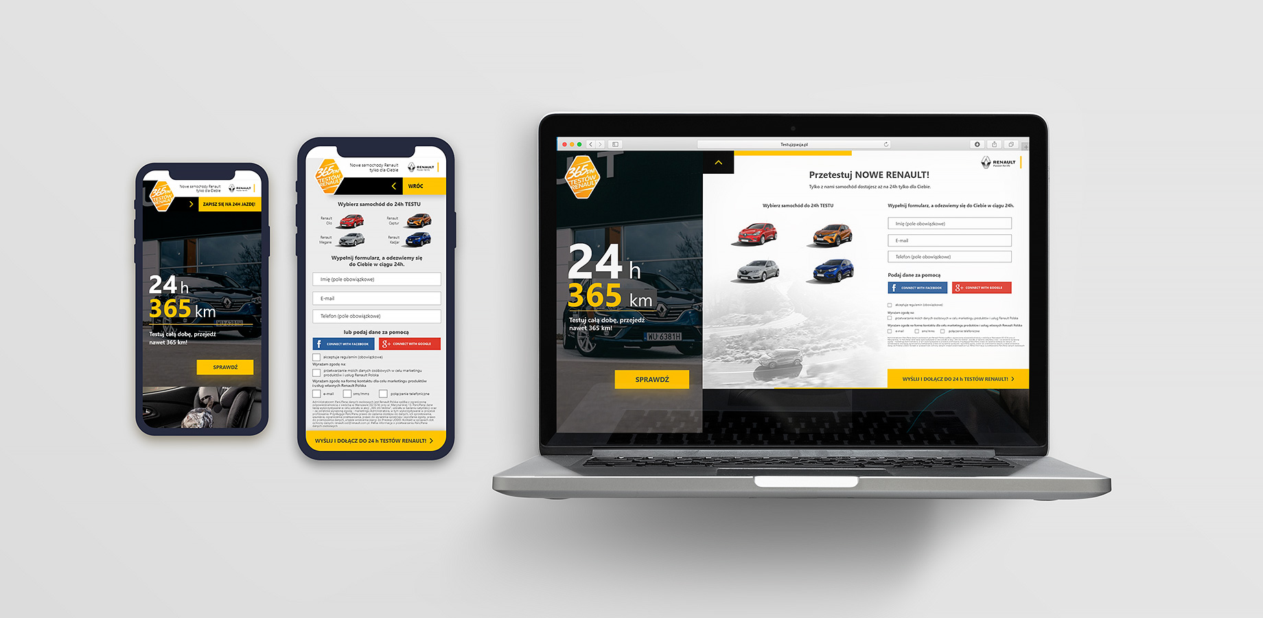
The biggest noticeable difference between the mobile and desktop versions is the content scrolling orientation. I decided to use the horizontal scroll in the desktop version (above) to slightly intrigue the user and I thought that such a movement harmonized very well with the vertical visuals that teas out the cases. In no way, however, this does not affect the difficulty of navigation because the page moves automatically at the mouse scroll and movement.

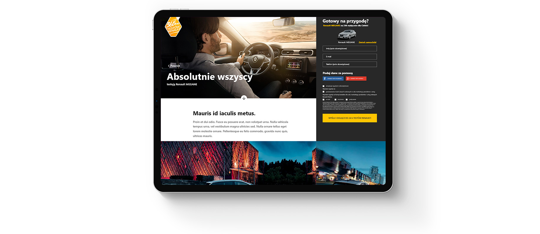
However on the mobile version, because of the very strongly grounded scrolling pattern, which is very convenien for your thumb, I decided to leave browsing the content on the main page in the vertical orientation. (left example)
On the subpages, where the car's features and videos are presented, the lead form has been pinned to the right edge of the screen with all visible fields and a pre-selected car to which you can subscribe. I also decided to add Social Media Connect buttons to even reduce the time needed to complete the form

As before, when scrolling the content, the form remains permanently visible with fixed position so the user never loses sight of it.
I wanted the user to feel the same, seamless experience regardless of the device by browsing testujzpasja.pl and that navigation and the possibility of signing up for test-drives were intuitive and friendly for people less familiar with techonology.

In addition, we provided the opportunity to test and implement the best solution by installing on the website functionality to perform A / B tests on random users.

Check out interactive mockups